Font pairing is a vital aspect of graphic design, whether you’re designing a business card or a website. It plays a crucial role in establishing a clear hierarchy within your text. Different fonts possess unique characteristics, such as weight, style, and spacing, that can be strategically utilized to differentiate headings, subheadings, body text, and other elements. By skillfully combining fonts that complement each other, designers create a visually pleasing structure that guides the viewer’s attention to the most important content. This, in turn, enhances the overall readability and legibility of the text, ensuring that it is easily comprehensible for the intended audience. By selecting fonts that work harmoniously and have appropriate contrast, the text becomes effortless to read in both print and digital formats.
Font Anatomy
To better understand font pairing, let’s simplify some basic typographic terms before we dive into font pairing tips:
- Typeface: Think of it as the overall design style for a group of characters (letters, numbers, punctuation) that share a similar look.
- Typeface Family: This refers to a group of typefaces within the same family that share similar design traits like thickness or shape.
- Font: This is a specific style and size within a typeface. For example, you might have Arial Bold or Times New Roman Italic.
- Glyphs: These are simply the individual characters within a typeface, including letters, numbers, and punctuation marks.
- Serif: Picture it as the extra strokes added to the ends of letters. Serif typefaces, like Times New Roman
- Sans-Serif: These are typefaces without those extra strokes (serifs), like Arial or Helvetica.
- Script: Imagine cursive handwriting in digital form. It’s known for its fluid, elegant curves, and you’ve likely seen it in fonts like Lobster.
- Slab Serif: These fonts have thick, block-like serifs that make them look bold and sturdy. Examples include Rockwell.

Now that you have an understanding of type classification terms, let’s explore how you can pair them expertly to create a well-balanced design. Here are five fantastic tips that I like to use:
1. Indulge in Superfamilies:
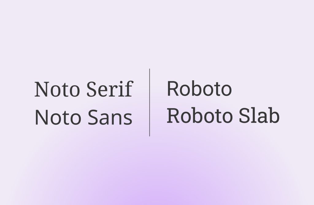
While we are all aware of using font families and various weights such as bold or italic, a surefire way to combine fonts seamlessly is by using superfamilies. These contain a wide range of different styles, tailor-made to pair flawlessly together. A few examples of these convenient superfamilies are Noto Serif/Noto Sans and Roboto/ Roboto slab.

2. Embracing Contrast
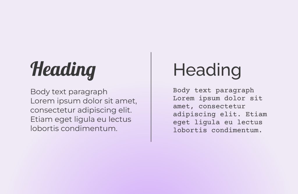
To achieve a harmonious and well-balanced composition, it’s a great idea to play with fonts that offer striking differences. For instance, try combining a bold serif font for titles and headings with a clean sans-serif font for your body text. This not only adds depth and dimension to your design but also elevates the overall layout. And of course, always choose fonts that align perfectly with the emotions and tone you want to convey in your design.

3. Exploring Glyph Characteristics
Let’s delve into a more advanced aspect of font selection – analyzing glyph characteristics. Don’t worry; I’m here to guide you through this with a practical example.
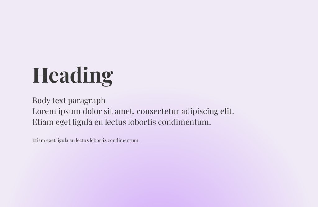
Initially, I used the elegant Playfair font in Black for headlines and Regular for body text. While it worked wonderfully for headlines, it posed readability challenges in the body text due to stark stroke contrast and tight letter spacing (kerning).

Now, what’s our alternative?
To find a more suitable option, let’s closely examine the letter construction, considering these factors:
- Letter Forms: Are the lowercase “a” and “g” single-story or two-story?
- Angle: What’s the angle of the letters? (Focus on the “o” for reference)
- Apertures: How open or closed are the inner spaces of the letter shapes? (Observe “e,” and “a”)
After looking at these three factors, I’ve chosen the Lato font. It features two-story lowercase “a” and “g”, maintains an almost straight angle, and offers a more closed aperture design. These attributes make it a well-suited alternative for a cohesive and contrasting design. While achieving a perfect match for all factors might not always be possible, what truly matters is ensuring that the design structures of these fonts exhibit a certain degree of similarity.
4. Keep Font Variety in Check
It’s crucial to avoid overwhelming your design with a multitude of fonts, which can lead to a cluttered and disorganized appearance. For a visually pleasing and easily readable outcome, it’s best to limit the number of fonts you use.
Typically, employing just two or three fonts in your design achieves the ideal balance. For instance, consider using a serif font for headings, a sans-serif font for the main text, and perhaps a script font for highlighting quotes or special callouts.
5. Harness Font Pairing Tools
Selecting the perfect font pairing can be a bit of a task, especially with an endless scroll of options. To simplify the process, there are handy font pairing tools available. These tools analyze font characteristics and suggest combinations that work well together. Examples include FontPair, Monotype and Adobe Fonts (formerly Typekit).
Font pairing stands as a fundamental skill for every graphic designer. The art of seamlessly blending different fonts, each with its distinct personality, profoundly influences how information is perceived and digested. Happy designing!


