Typography plays a crucial role in how we understand and interpret written language, and even perceive brands. Some studies have explored how fonts affect the brain by using neuroimaging techniques. These studies suggest that certain fonts can activate different areas of the brain associated with emotions and cognition.
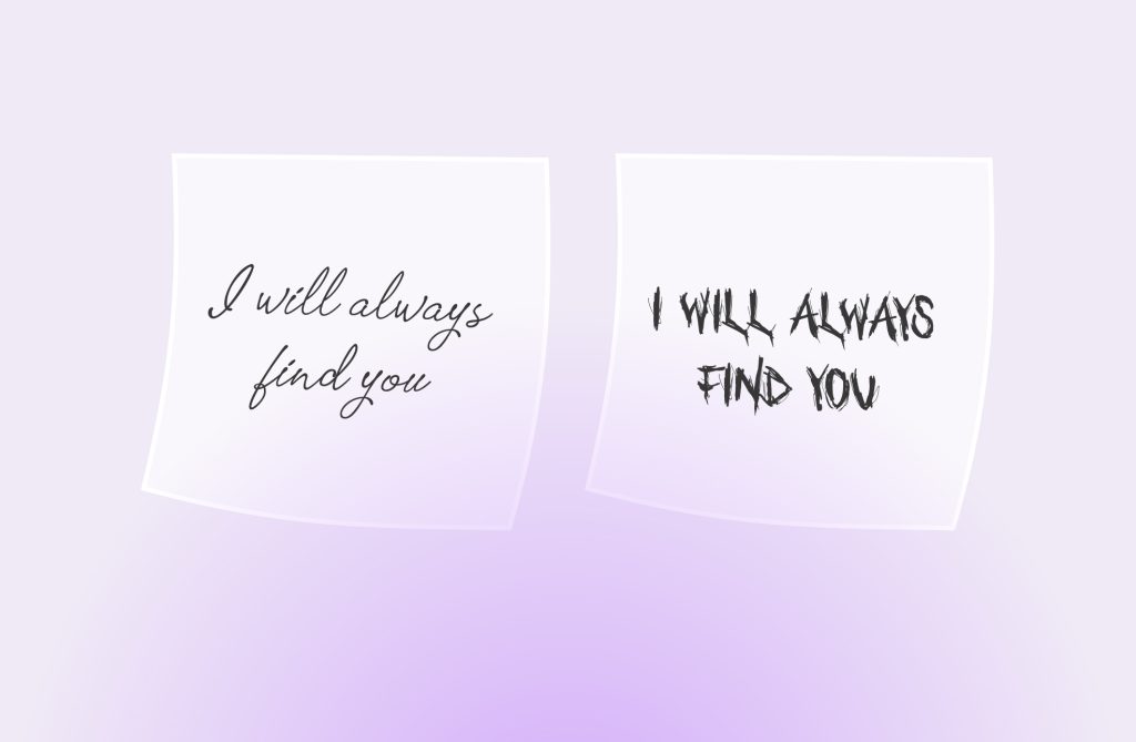
Font psychology explores the idea that the typeface or font used to present text can evoke specific emotional responses and convey messages beyond the literal meaning of the words. By examining the subtle cues and connotations associated with different typefaces, we can make more informed decisions to evoke specific emotions or reactions from our target audience.
Let’s take an in-depth look into how fonts work on a psychological level and how you can choose the right font for your design.
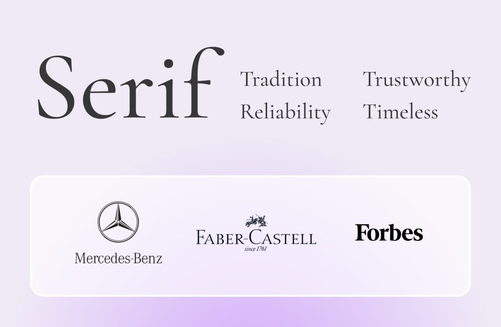
Serif Fonts:
Serif fonts are distinguished by the small decorative lines or strokes added to the ends of the main strokes in each letter. These small lines, called serifs, give the characters a more formal and traditional appearance. The serifs help guide the eye along the text, creating a smooth reading experience. Serif fonts are commonly used for body text in printed materials such as books and newspapers. Examples of serif fonts include Times New Roman, Garamond, and Georgia.
Serif fonts evoke a sense of tradition, reliability, and elegance. The small decorative lines or strokes at the ends of the characters give them a timeless and classic feel. These fonts can convey a sense of authority and sophistication, making them ideal for formal or professional settings. They can also evoke feelings of comfort and familiarity, reminiscent of the printed word. Serif fonts are often used in body text, as they promote readability and create a calm and trustworthy atmosphere.
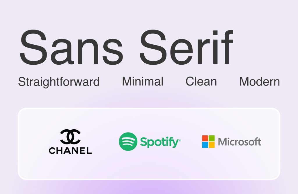
Sans Serif Fonts:
In contrast to serif fonts, sans-serif fonts do not have decorative serifs on the ends of the strokes. They have a clean and minimalistic appearance, making them popular for digital designs and modern applications. Sans serif fonts are often used for headlines, website content, and user interfaces where legibility and simplicity are key. Arial, Helvetica, and Verdana are some well-known examples of sans serif fonts.
Sans serif fonts exude a contemporary, clean, and modern vibe. Their simplicity and lack of decorative strokes give them a minimalist and straightforward appearance. Sans-serif fonts are associated with efficiency, progress, and a forward-thinking attitude. They also convey a sense of directness and objectivity and their clean lines make them easily readable, particularly in smaller sizes and on digital screens.
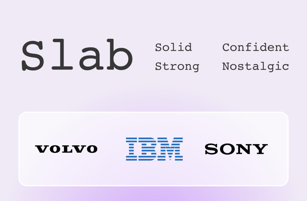
Slab Fonts:
Slab fonts, also known as Egyptian or mechanistic fonts, feature thick, block-like serifs that are rectangular in shape. These chunky serifs create a strong impression and make slab fonts stand out. Popular slab fonts include Rockwell, Courier, and Clarendon.
Slab fonts carry a bold and robust emotional impact. Their heavy, uniform strokes communicate strength, solidity, and confidence. Slab fonts often evoke feelings of dependability and assertiveness. They can be perceived as rugged and enduring, making them suitable for designs that require a commanding presence. Slab fonts can also transport the viewer to a bygone era, creating a sense of nostalgia and authenticity.
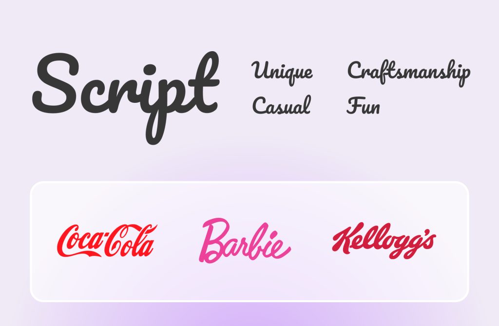
Script Fonts:
Script fonts mimic handwriting or calligraphy, with their flowing and connected letters. They add a touch of elegance, personality, and sophistication to designs. Script fonts can range from formal and traditional styles to more casual and playful ones. They are commonly used for invitations, wedding materials, and branding projects where a touch of flair and personality is desired. Examples of script fonts include Pacifico, Delius, and Seaweed Script.
Script fonts add a touch of elegance, sophistication, and personality to designs. These fonts mimic handwritten or calligraphic styles, creating a sense of artistry and craftsmanship. Depending on the specific script font, they can evoke a range of emotions, such as romance, playfulness, formality, or nostalgia. Script fonts are commonly used in any design that aims to convey a personal touch and a sense of human connection.
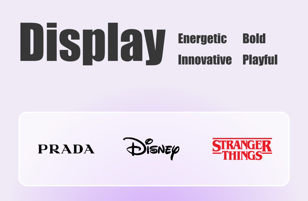
Display Fonts:
Display fonts are attention-grabbing and designed to make a bold statement. They come in various styles, from serif and sans serif to script and decorative fonts. What makes them distinct is their unique and exaggerated letterforms, which may feature unconventional shapes, spacing, or ornamentation. Some popular display fonts include Impact, Bebas Neue, and Lobster.
Display fonts offer a wide range of emotional possibilities, depending on their style and design. They can be playful, quirky, and expressive, evoking excitement, energy, and a sense of fun. Display fonts allow for creative and artistic expressions that can surprise and captivate the viewer. They often convey uniqueness, making them suitable for designs that aim to stand out and make a statement. Display fonts have the potential to evoke a wide spectrum of emotions, from curiosity and delight to boldness and innovation.
Bold vs Medium vs Light
From a bold and powerful proclamation that grabs your attention to a delicate and refined expression that whispers elegance, font weights play a significant role in shaping the way we interpret the messages before us.
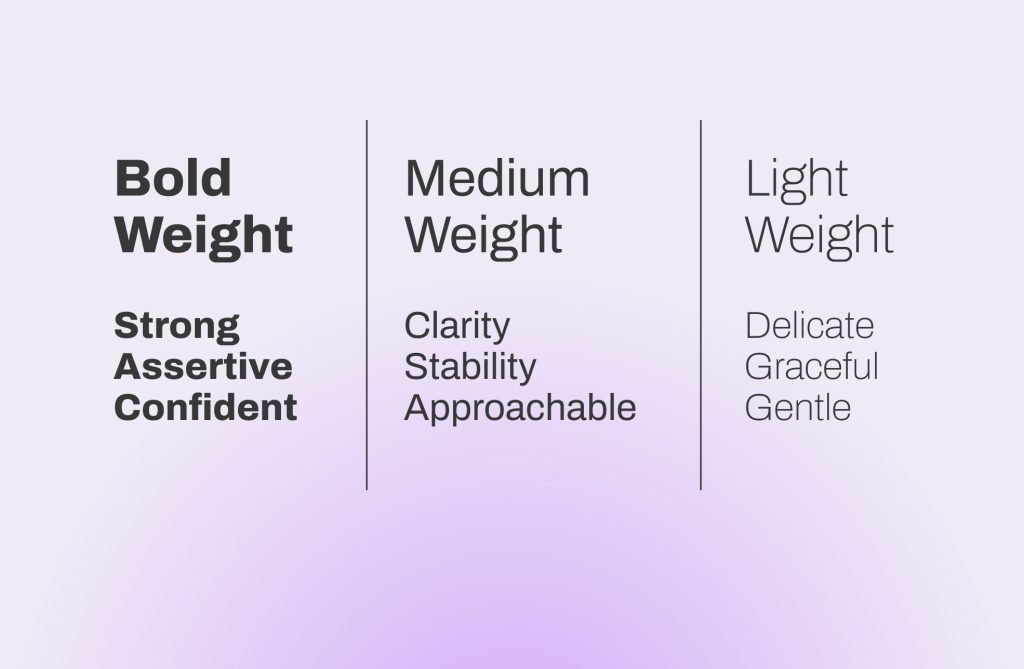
Medium Font Weight:
Medium-weight fonts strike a balance between boldness and lightness. They are versatile and can convey a sense of clarity, stability, and readability. Medium fonts often appear balanced and approachable, making them suitable for body text and content that requires a neutral and straightforward appearance. They can create a sense of reliability without overwhelming the reader.
Light Font Weight:
Light fonts are delicate, graceful, and gentle in their appearance. They convey a sense of subtlety, elegance, and softness. Light fonts often evoke feelings of sophistication, delicacy, and airiness. They are used when designers want to create a sense of refinement and understated beauty. Light fonts can be seen as calm and soothing, making them suitable for designs that aim to create a relaxed or ethereal atmosphere.
Typography goes beyond just arranging words on a page or screen. It’s a reminder that design is not just about aesthetics but also serves as a medium for empathy, expression, and storytelling.
As you embark on your design journey, always remember the potential that every font, weight, and style carries. Each typographic element can evoke emotions, spark connections, and craft narratives that resonate deeply with your audience. Embrace the artistry of typography, and use it to infuse your designs with the full spectrum of human emotions. In the end, it’s not just about what you write; it’s about how you feel it through typography.


