Design is both an art and a science. It demands creativity, structure, and consistency to ensure that the end product is both functional and aesthetically pleasing. One of the most effective tools in a designer’s arsenal is the grid system.
What is a Grid System?
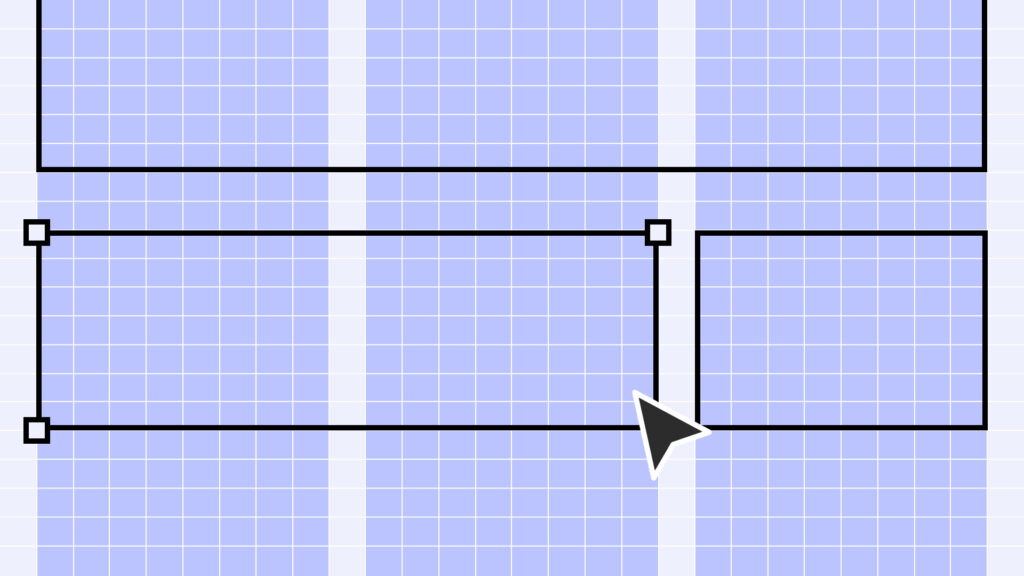
A grid system is a framework composed of horizontal and vertical lines used to arrange content on a page. It divides the page into columns, margins, and rows, creating a structured layout that helps designers organize information clearly and predictably.
The History of the Grid System
Our tale of grids dates back to ancient civilizations, where scribes used grids to align text on papyrus scrolls. Fast forward to the 20th century, and Swiss design maestros like Josef Müller-Brockmann championed the use of grid systems in graphic design. Today, grid systems are the backbone of design across various mediums, from print to web and beyond.
Types of Grid Systems

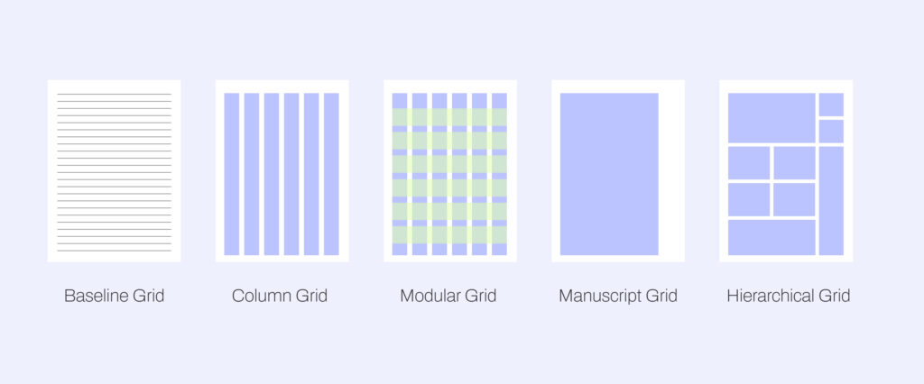
Baseline Grid: Ensures that the baselines (the imaginary lines upon which text sits) of all the text blocks align vertically. This creates a uniform and balanced appearance, improving readability and aesthetic appeal.
Column Grid: It consists of multiple columns, allowing for more complex layouts. Commonly used in magazines and newspapers.
Modular Grid: It divides the page into a matrix of rows and columns, creating modules that can contain different types of content. Ideal for complex publications with diverse content types.
Manuscript Grid: A simple grid with a single column, often used for traditional books and lengthy text documents.
Hierarchical Grid: More flexible and less uniform, used when the design requires varied column widths and row heights. Suitable for expressive and creative layouts.
When You Start Using Grid Systems, You…
1. Ensure Consistency
Consistency is key in design. Whether you’re working on a website, a magazine, or a marketing campaign, maintaining a consistent layout throughout your project helps create a cohesive look and feel. A grid system provides a structured framework that ensures elements are aligned and spaced uniformly. This uniformity helps create a visual rhythm, making it easier for users to navigate and comprehend the design.
2. Enhance Readability
Readability is a fundamental aspect of effective design. A well-implemented grid system organizes content in a logical and easy-to-follow manner, guiding the reader’s eye across the page in a predictable way. This is particularly important in editorial design, where large amounts of text need to be presented clearly and efficiently.
3. Save Time and Effort
Designing without a grid can lead to chaos and inconsistency, requiring constant adjustments and realignments. A grid system streamlines the design process by providing a clear structure from the outset. This not only saves time but also reduces the cognitive load on the designer, allowing for more focus on creative aspects.
4. Facilitate Flexibility and Adaptability
While grids provide structure, they also offer flexibility. Designers can choose from various grid types—such as manuscript grids, column grids, modular grids, and hierarchical grids—depending on the project’s needs. This adaptability allows for creativity within the confines of the grid, ensuring that designs remain dynamic and engaging.
5. Promote Professionalism
Using a grid system conveys professionalism and attention to detail. A design that adheres to a grid looks polished and well-thought-out, reflecting positively on the designer and the brand. Clients and stakeholders are more likely to trust and value work that demonstrates a clear, methodical approach.
6. Improve User Experience
A well-designed grid enhances the overall user experience by making the interface intuitive and easy to navigate. This is particularly important in web design, where user interaction and satisfaction are paramount. Grids help create a logical flow of information, guiding users effortlessly through the content.
Practical Tips for Using a Grid System
- Start Simple: Begin with a basic grid and add complexity as needed. This helps in maintaining clarity and focus.
- Be Consistent: Apply the grid consistently across all pages to ensure a cohesive design.
- Use Whitespace: Don’t be afraid of whitespace. It enhances readability and provides a clean, uncluttered look.
- Experiment Within the Grid: While grids provide structure, they shouldn’t stifle creativity. Experiment with different arrangements within the grid to keep the design interesting.
- Test and Iterate: Test your design with real content and iterate based on feedback. This ensures that the grid system works effectively in practice.

Grid systems are essential for designers, providing balance, alignment, and rhythm. They boost the design’s look and usability. Mastering grids leads to consistently great work, creating attractive and user-friendly experiences. For a deep dive into grid systems, check out Josef Müller-Brockmann’s book “Grid Systems”.


