
Science with purpose. Care with precision.
Science that Protects and Connects
Over 30 years advancing public health through precision, innovation, and trust.
With over 30 years of experience, Biogerm has become a trusted name in public health. The company combines scientific precision with a human approach, providing reliable and innovative analytical solutions that help ensure safety, quality, and well-being.
For this project, we redefined the brand visual identity, defining the principles that shape Biogerm’s brand expression. It brings together the brand’s essence, values, and personality, ensuring consistency and inspiration across all communication and touchpoints.
How can Biogerm become a more approachable brand, communicating in a human, contemporary, and engaging way, while staying true to its core identity?
Evolve the visual identity
Give the brand a more contemporary and harmonious look while preserving its recognizable essence of rigor and technical quality.
Design a versatile and adaptable visual system
Reflect the brand’s practical experience in its visual language — conveying empathy, closeness, and care at every touchpoint.
Foster community connection and trust
Ensure that every interaction with the brand is clear, engaging, and memorable, leaving a lasting positive impression on its audience.
Opportunities for Evolution
The previous identity revealed several opportunities for evolution. Its concentrated colour palette, centred on a dominant green, limited contrast and adaptability across different applications. The lack of supporting graphic elements and photographic guidelines reduced expressiveness and made it difficult to establish a distinctive visual language.
The typographic system offered little variety, which restricted hierarchy and clarity across materials. In addition, the overall structure provided minimal flexibility to scale as the brand expanded into new markets, channels, and formats. Redefining these elements allowed the identity to become more versatile, balanced, and future-ready, maintaining Biogerm’s essence while broadening its visual reach.
Biogerm’s identity evolves through a more versatile and expressive visual system. The colour palette expands with complementary and neutral tones, providing greater contrast and flexibility for harmonious application across different media. Flexible graphic elements , including icons, patterns, and visual motifs, enhance brand expressiveness and support both digital and print applications.
The typographic system is updated with a variety of weights and styles, ensuring legibility while reinforcing the brand’s personality across all touchpoints. At the same time, a scalable visual foundation establishes a cohesive system that grows with the brand, maintaining consistency and clarity as Biogerm reaches new markets, channels, and audiences.
WHAT WE DID
- Color and Type System
- Iconography
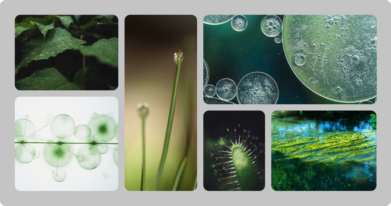
- Photography curation
- Art Direction
- Brand Guidelines


Biogerm’s refreshed identity comes to life through clear, engaging visuals that communicate expertise and reliability. The expanded colour palette, flexible graphics, and updated typography create memorable, trustworthy experiences across all touchpoints.
Consistency and cohesion are ensured across every application, reinforcing the brand’s personality while leaving a lasting positive impression. The evolved system adapts seamlessly to different formats, strengthening recognition and connection with the audience.
WHAT WE DID
- Stationery
- Packaging
- Corporate presentation
- Vehicle fleet
Cohesive Brand Identity
Verbal, visual, and sub-brand system aligned across every touchpoint.
Scalable Assets
Pitch decks and stationery built to scale.
5.0
Working with Phi Creative has been an excellent experience. What I appreciated the most was their ability to transform a briefing into a high-impact project with real added value.
They listened carefully to the client, understood the needs, the target audiences, what the company does and what sets it apart and translated all of that into a coherent and compelling brand concept. They delivered within the agreed timelines and maintained constant, transparent communication throughout the entire process. They managed to reach an excellent first version of the concept from the very start. I would strongly recommend Phi Creative for brand and visual identity projects.